Text
This component renders a text string in one row. You can specify font color, size, and weight for the text string.
The text string of a text component to be sent can be written in multiple languages, and it will be displayed in the language that matches the client device's language settings.
Request {#text-request-parameter}
| Parameter | Type | Required | Description |
|---|---|---|---|
| type | string | Y | Set this parameter to text. |
| text | string | Y | Text string. Either text or contents must be specified.The contents property overrides the text property. |
| contents | array of objects | N | Text strings of a span. Either text or contents must be specified.The contents property overrides the text property. |
| flex | number | N | The proportion of the width or height of the component within the parent component. For more information, see Width and height of components. |
| margin | string | N | The minimum space between the component and the previous component in the parent component. For more information, see margin. |
| position | string | N | The reference point for the offsetTop, offsetBottom, offsetStart, and offsetEnd properties. Specify one of the following values:• relative: Uses the previous box as the reference point.• absolute: Uses the upper left corner of the parent component as the reference point.The default value is relative. For more information, see Offset. |
| offsetTop | string | N | Top offset. For more information, see Offset. |
| offsetBottom | string | N | Bottom offset For more information, see Offset. |
| offsetStart | string | N | Left offset. For more information, see Offset. |
| offsetEnd | string | N | Right offset. For more information, see Offset. |
| size | string | N | Font size. Specify one of the following values: xxs, xs, sm, md, lg, xl, xxl, 3xl, 4xl, and 5xl.The font size increases in the order the values are listed. The default value is md. |
| align | string | N | Horizontal alignment. For more information, see Horizontal alignment. |
| gravity | string | N | Vertical alignment. For more information, see Vertical alignment. |
| wrap | boolean | N | If it is set to true, you can wrap text around a line. The default value is false.If true, you can use a new line character (\n) to begin on a new line.For more information, see "Wrapping text" in Flexible Template Elements . |
| maxLines | number | N | The maximum number of rows to display text strings. To specify this parameter, the wrap parameter must be set to true.Any text that does not fit within the specified number of rows is replaced by an ellipsis. If it is 0, all the strings will be displayed.The default value is 0 . |
| weight | string | N | Font weight. Specify either regular or bold.If it is bold, the text string is made bold.The default value is regular. |
| color | string | N | Font color. Set a hex color code. |
| action | object | N | The action that occurs when the text is tapped. Specify an action object. |
| style | string | N | Font style. Specify one of the following attribute values: • normal: No style• italic: ItalicsThe default value is normal. |
| decoration | string | N | Text decoration. Specify one of the following attribute values: • none: No decoration• underline: Underscore• line-through: StrikethroughThe default value is none. |
Request example {#text-request-example}
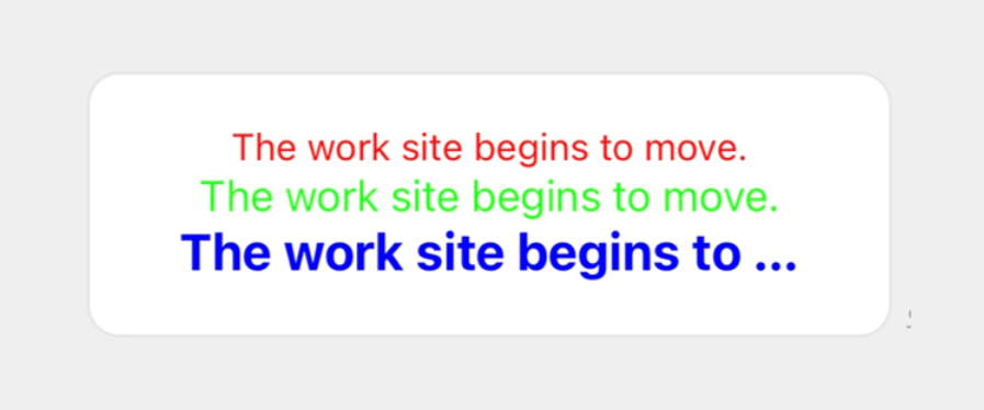
{ "type": "bubble", "body": { "type": "box", "layout": "vertical", "contents": [ { "type": "text", "text": "The work site begins to move.", "size": "sm", "align": "center", "color": "#ff0000" }, { "type": "text", "text": "The work site begins to move.", "size": "md", "align": "center", "color": "#00ff00" }, { "type": "text", "text": "The work site begins to move.", "size": "lg", "align": "center", "weight": "bold", "color": "#0000ff" } ] }}