Flexible Template Elements
A flexible template consists of three nested data elements: container, block, and component. This page explains elements constituting a flexible template.
Container {#container}
A container is the top-level element of a flexible template. Here are the types of containers available:
| Type | Description |
|---|---|
bubble | A container that displays a single message bubble. |
carousel | A container that displays multiple message bubbles arranged side by side. |
Bubble {#container -bubble}
A bubble is a container that contains one message bubble.
For more information about JSON schemas, see Bubble in Flexible Template.
Carousel {#container -carousel}
A carousel is a container that contains multiple bubble elements. The bubbles in a carousel can be browsed by scrolling horizontally.
For more information about JSON schemas, see Carousel in Flexible Template.
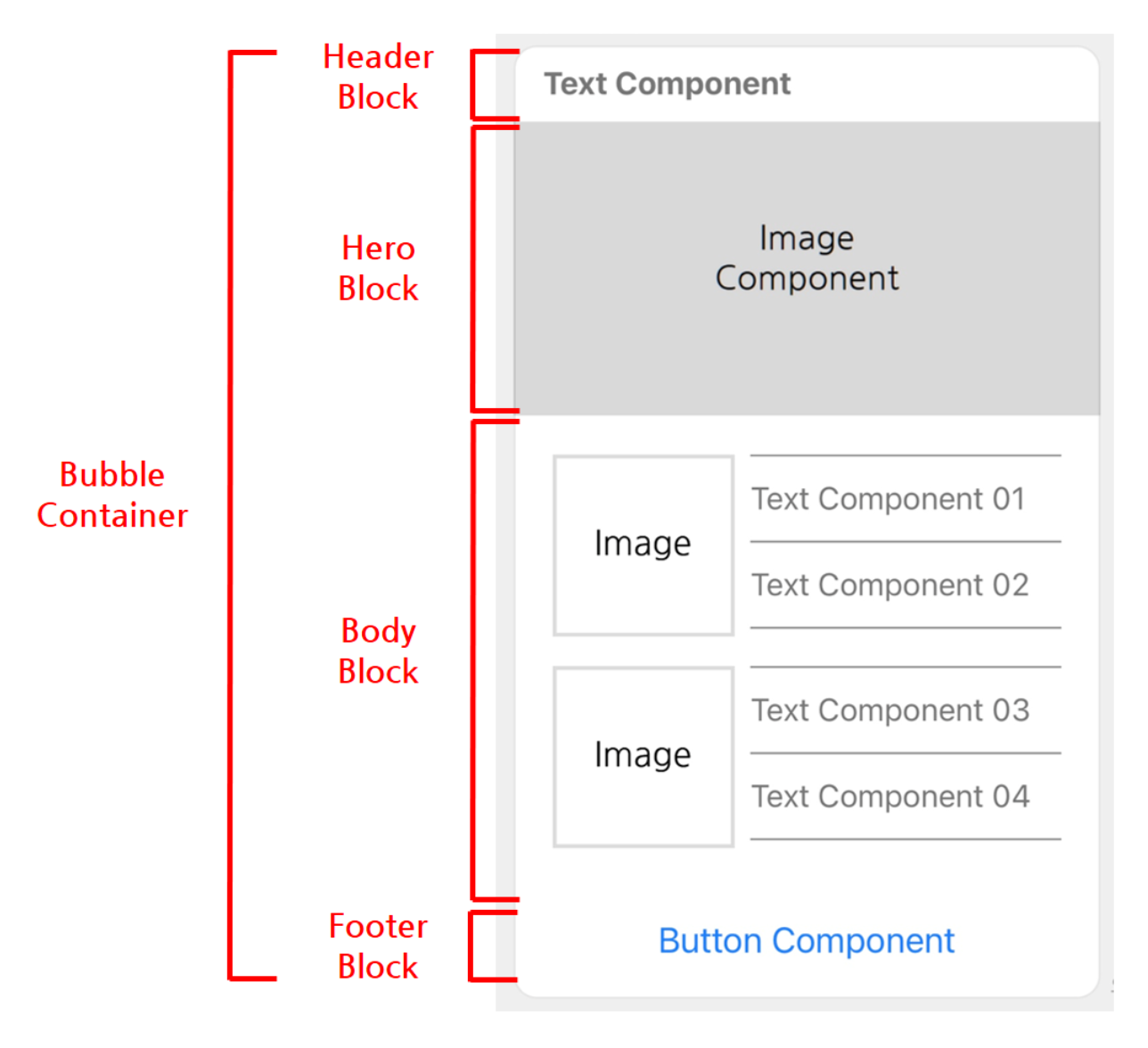
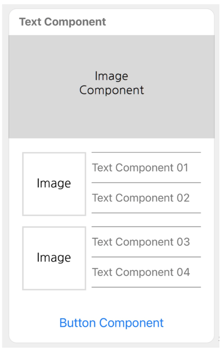
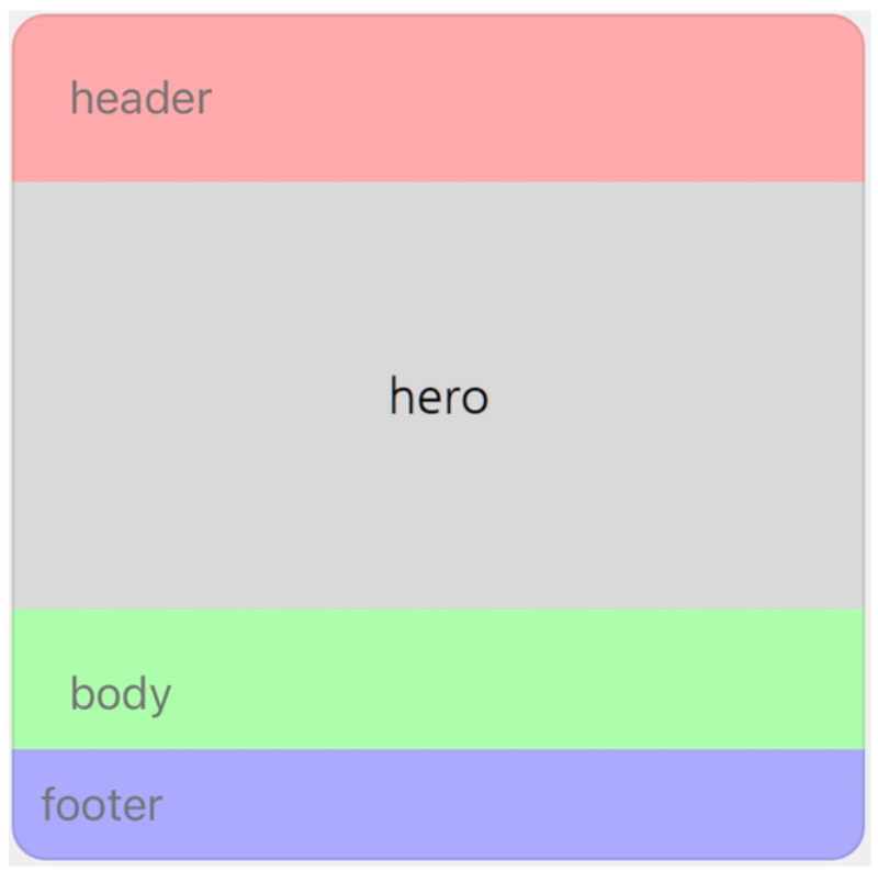
Block {#block}
Blocks are elements that make up a bubble. Here are the types of blocks available:
| Type | Description |
|---|---|
header | This block displays a message subject or header. |
hero | This block displays primary image content. |
body | This block displays major message content. |
footer | This block displays buttons and supplementary information. |
The order of block types displayed from the top of a bubble is: header, hero, body, and footer. Each block type can be specified only once in a bubble (or omitted).
For more information about JSON schemas, see the description of the header, hero, body, and footer properties in Bubble in Flexible Template.
Component {#component}
components are elements that make up a block. Here are the types of components available:
| Type | Description |
|---|---|
box | This component defines the layout of the other components. |
button | This component renders a button. When the button is pressed, a specified action is performed. |
image | This component renders an image. |
icon | This component renders an icon. |
text | This component renders a text string in a single row. You can specify the font color, size, and weight for the text string. |
span | This component renders multiple text strings with different designs in one row. You can specify the font color, size, weight, and style for the text string. |
separator | This component renders a separating line. |
filler | This component inserts an empty space. |
Box {#box}
This component is used to define the layout of a message.
It can include other components such as boxes, buttons, or images. Such a component added under a box, also called "child component," is laid out according to the properties of the box as well as its own. For more information about layouts, see Box in Flexible Template.
For more information about JSON schemas, see Box in Flexible Template.
Button {#button}
This component renders a button.
When the button is tapped, a specified action is performed. For more information about actions, see Action Objects.
There are three styles for a button, and you can change the color of the button with any of the styles.
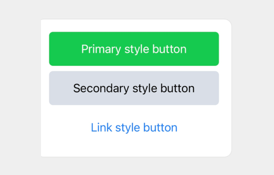
For more information about JSON schemas, see Button in the Flexible Template API document.
Image {#image}
This component renders an image.
For more information about JSON schemas, see Image in Flexible Template.
Icon {#icon}
This component renders an icon for decorating the adjacent text.
It can be used only in a baseline box.
For more information about JSON schemas, see Icon in Flexible Template.
Text {#text}
This component renders a text string in one row. You can specify the font color, size, and weight for the text string.
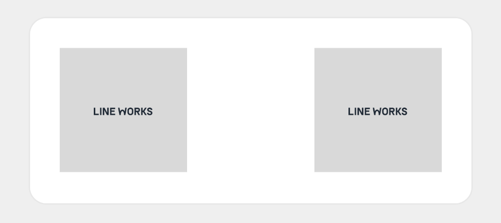
Text line break {#text-wrap}
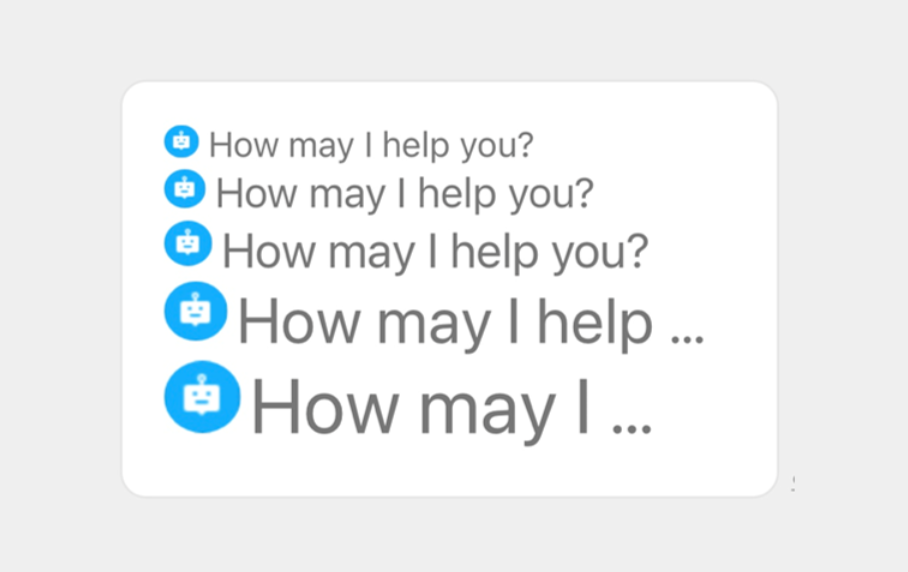
By default, any text that overflows beyond the width of the text string is replaced by an ellipsis.
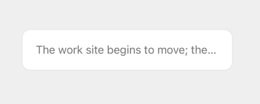
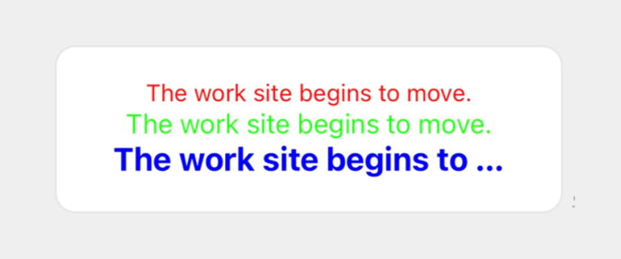
You can create the flexible template above with the following JSON data.
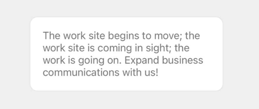
{ "type": "bubble", "body": { "type": "box", "layout": "horizontal", "contents": [ { "type": "text", "text": "The work site begins to move; the work site is coming in sight; the work is going on. Expand business communications with us!" } ] }}You can wrap long text around a line by setting the wrap property to true. Also, you can use a new line character (\n) to begin on a new line.
Note
- How
\nis rendered at the end of a text string may depend on the device environment.
You can create the flexible template above with the following JSON data.
{ "type": "bubble", "body": { "type": "box", "layout": "horizontal", "contents": [ { "type": "text", "text": "The work site begins to move; the work site is coming in sight; the work is going on. Expand business communications with us!", "wrap": true } ] }}For more information about JSON schemas, see Text.
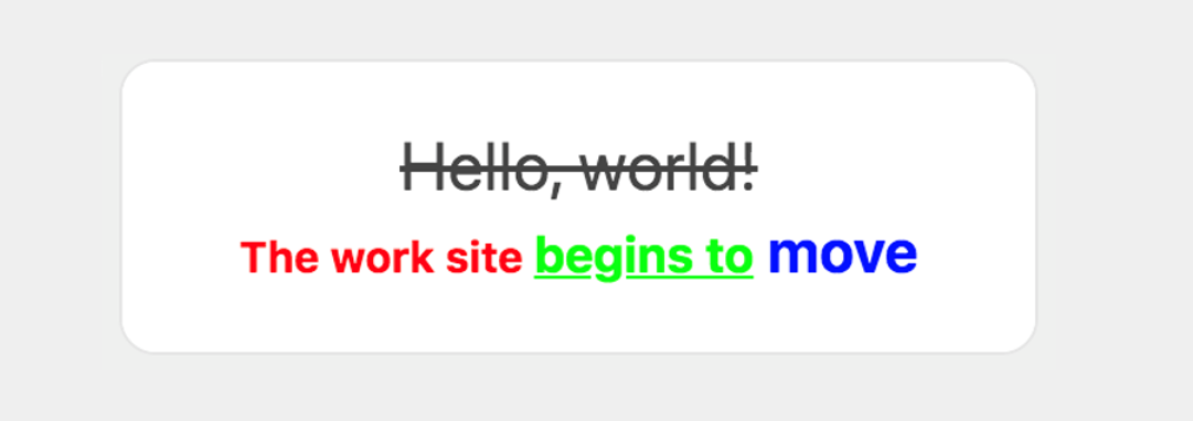
Span {#span}
This component renders multiple text strings with different font properties in one row, You can specify the font color, size, weight, and style for the text string. A span is specified by the contents property of a text component.
For more information about JSON schemas, see Span in the Flexible Template API document.
Separator {#separator}
This component renders a separating line within a box. If it is added to a horizontal box, a vertical line is drawn; if added to a vertical box, a horizontal line is drawn.
For more information about JSON schemas, see Separator in Flexible Template.
Filler {#filler}
This component is used to create an empty space. You can put space between, before, or after components by inserting a filler anywhere within a box.
The following example uses a filler to create space between the images.
For more information about JSON schemas, see Filler in Flexible Template.