Button
This component renders a button. If a button is tapped, a specified action is performed.
Request {#button-request-parameter}
| Parameter | Type | Required | Description |
|---|---|---|---|
| type | string | Y | Set this parameter to button. |
| action | string | Y | The action that occurs when the button is tapped. Specify an action object. |
| flex | number | N | The proportion of the width or height of the component within the parent component. For more information, see Width and height of components. |
| margin | string | N | The minimum space between the component and the previous component in the parent component. For more information, see margin. |
| position | string | N | The reference point for the offsetTop, offsetBottom, offsetStart, and offsetEnd properties. Specify one of the following values:• relative: Uses the previous box as the reference point.• absolute: Uses the upper left corner of the parent component as the reference point.The default value is relative. For more information, see Offset. |
| offsetTop | string | N | Top offset. For more information, see Offset. |
| offsetBottom | string | N | Bottom offset. For more information, see Offset. |
| offsetStart | string | N | Left offset. For more information, see Offset. |
| offsetEnd | string | N | Right offset. For more information, see Offset. |
| height | string | N | Button height. Specify either sm or md. The default value is md. |
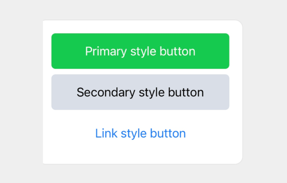
| style | string | N | Button style. Specify one of the following values. • primary: Button style in a darker color• secondary: Button style in a lighter color• link: HTML link style.The default value is link. |
| color | string | N | The text color of the button when the style property is link.The background color of the button when the style property is primary or secondary.Set a hex color code. |
| gravity | string | N | Vertical alignment. For more information, see Vertical alignment. |
Request example {#button-request-example}
{ "type": "bubble", "body": { "type": "box", "layout": "vertical", "spacing": "md", "contents": [ { "type": "button", "style": "primary", "action": { "type": "uri", "label": "Primary style button", "uri": "http://worksmobile.com" } }, { "type": "button", "style": "secondary", "action": { "type": "uri", "label": "Secondary style button", "uri": "http://worksmobile.com" } }, { "type": "button", "style": "link", "action": { "type": "uri", "label": "Link style button", "uri": "http://worksmobile.com" } } ] }}