How to Lay Out Components
You can build a more complex flex template layout based on CSS Flexbox (CSS Flexible Box), where a "flex container" and "flex item" in the recommendation are equivalent to a "box component" and "component" in the flexible template, respectively.
This page explains how to adjust the overall layout, as well as the size and alignment of child components in a box. For more information about JSON schemas, see Flexible Template.
- Layout direction of components
- Available components
- Baseline box characteristics
- Width and height of components
- Width of components in a horizontal box
- Height of components in a vertical box
- Box width
- Box height
- Size of other components
- Positioning of components
- Horizontal alignment
- Vertical alignment
- Box padding
- spacing
- margin
- Offset
- Rendering order
Layout direction of components {#component-placement-direction}
You can decide which direction to lay out child components by deciding the direction of the main axis of a box. There are three layout types for child components in a box.
You can specify the direction in which child components are laid out using the layout property of the box.
| Layout type ( layout values) | Description |
|---|---|
| horizontal | The child components are laid out horizontally. You can specify the direction in which child components are laid out using the direction property of the bubble.A box with this layout type is called a horizontal box. |
| vertical | The child components are laid out vertically. A box with this layout type is called a vertical box. |
| baseline | The child components are laid out in the same direction as a horizontal box. For more information about differences from a horizontal box, see "Baseline box characteristics". A box with this layout type is called a baseline box. |
Available components {#available-component}
The components that can be added as child components of a box differ depending on the type of the box.
| Horizontal box | Vertical box | Baseline box | |
|---|---|---|---|
| Box | O | O | X |
| Button | O | O | X |
| Image | O | O | X |
| Icon | X | X | O |
| Text | O | O | O |
| Span ※ This can be used as a child component of text. | X | X | X |
| Separator | O | O | X |
| Filler | O | O | O |
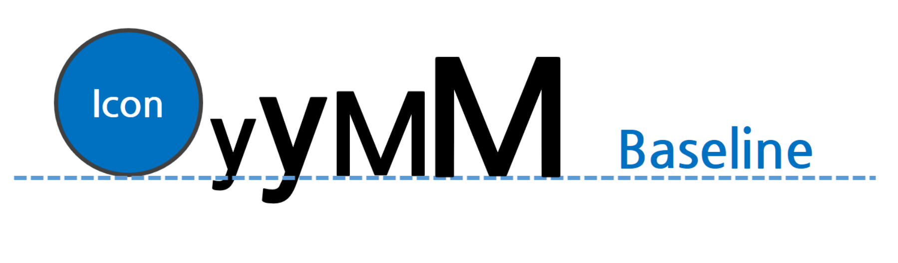
Baseline box characteristics {#baseline}
A baseline box basically behaves in the same way as a horizontal box, except in the following cases.
Vertical alignment {#baseline-diff-vertical}
Alignment in the vertical direction is fixed at the text baseline. Texts with different font sizes are also aligned at the baseline.
The baseline of an Icon is the bottom of the icon image.
Unavailable properties {#unavailable-property-with-baseline}
The following properties are unavailable in a baseline box:
gravitypropertyoffsetBottomproperty (to be available later)
Width and height of components {#component-height-width}
You can specify the width or height of components for which the position property is set to relative using the flex property of each component.
Width of components in a horizontal box {#width-in-horizontal}
In a horizontal box, if the flex property of a component is set to 1 or higher, the component is assigned blank space based on the value. For components in a horizontal box, the default value of the flex property is 1.
For example, if there are two components in a horizontal box with the flex properties of 2 and 3 respectively, each component is assigned blank space (the width of the box in this example) at a ratio of 2:3.
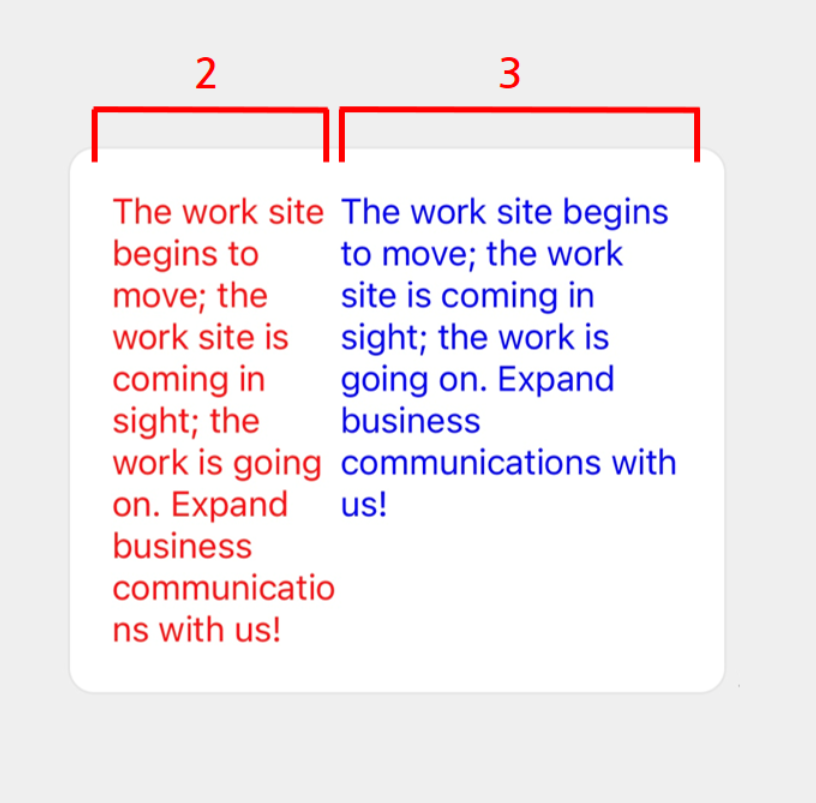
You can create the flexible template above with the following JSON data.
{ "type": "bubble", "body": { "type": "box", "layout": "horizontal", "contents": [ { "type": "text", "text": "The work site begins to move; the work site is coming in sight; the work is going on. Expand business communications with us!", "wrap": true, "color": "#ff0000", "flex": 2 }, { "type": "text", "text": "The work site begins to move; the work site is coming in sight; the work is going on. Expand business communications with us!", "wrap": true, "color": "#0000ff", "flex": 3 } ] }}If the flex property is 0, the component's width will expand to fit its content. However, if the component's width exceeds the box's, the excess part will not be displayed.
In the following example, the box has three components with the flex properties of 0, 2, and 3, respectively. Since the first component's flex property is 0, the component is assigned a sufficient width to display "Hello" included in it. Then, the second and third ones are assigned blank space (in the following example, the part excluding the first component's width from the box's width) at a ratio of two to three (2:3).
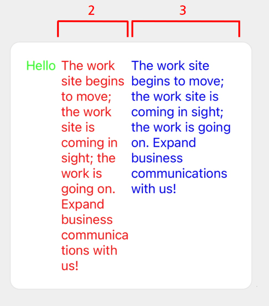
You can create the flexible template above with the following JSON data.
{ "type": "bubble", "body": { "type": "box", "layout": "horizontal", "contents": [ { "type": "text", "text": "Hello", "color": "#00ff00", "flex": 0 }, { "type": "text", "text": "The work site begins to move; the work site is coming in sight; the work is going on. Expand business communications with us!", "wrap": true, "color": "#ff0000", "flex": 2 }, { "type": "text", "text": "The work site begins to move; the work site is coming in sight; the work is going on. Expand business communications with us!", "wrap": true, "color": "#0000ff", "flex": 3 } ] }}About correspondences with
flexin CSS Flexbox
- The
flexproperty of a horizontal box corresponds to theflexin CSS Flexbox as described in the following.
flex = 0is equivalent toflex: 0 0 autoin CSS Flexbox.- If
flexis more than 0, it is equivalent toflex: X 0 0in CSS Flexbox (where X is the value offlex).
Height of components in a vertical box {#hight-in-vertical}
In a vertical box, if the flex property of a component is set to 1 or higher, the component is assigned blank space based on the value. For components in a vertical box, the default value of the flex property is 0.
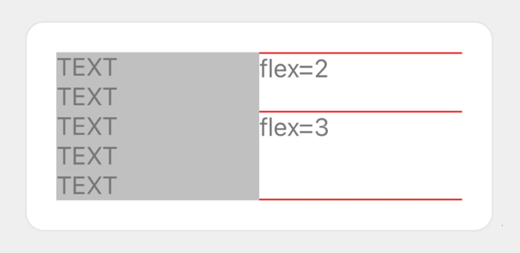
Each component is laid out according to the rules given below:
- Since the vertical box on the left has a height of five rows, the vertical box on the right also has the same height.
- The vertical box on the right has blank space that is not filled by two texts (one row each) and three separators alone.
- Blank space is then divided at a ratio of
2:3based on the flex values (2and3) of the two texts, and is assigned to each component.
You can create the flexible template above with the following JSON data.
{ "type": "bubble", "body": { "type": "box", "layout": "horizontal", "contents": [ { "type": "box", "layout": "vertical", "contents": [ { "type": "text", "wrap": true, "text": "TEXT\nTEXT\nTEXT\nTEXT\nTEXT" } ], "backgroundColor": "#c0c0c0" }, { "type": "box", "layout": "vertical", "contents": [ { "type": "separator", "color": "#ff0000" }, { "type": "text", "text": "flex=2", "flex": 2 }, { "type": "separator", "color": "#ff0000" }, { "type": "text", "text": "flex=3", "flex": 3 }, { "type": "separator", "color": "#ff0000" } ] } ] }}About correspondences with
flexin CSS Flexbox
- The
flexproperty of a vertical box corresponds to theflexin CSS Flexbox as described in the following.
flex = 0is equivalent toflex: 0 0 autoin CSS Flexbox.- If
flexis more than 0, it is equivalent toflex: X 0 autoin CSS Flexbox (where X is the value offlex).
Box width {#box-width}
You can specify the width of a box with the width property, in % (the percentage with reference to the width of the parent component) or in pixels.
Note that if you specify the width property in a horizontal box or baseline box, the flex property is set to 0.
When the
widthproperty is specified in pixels
- A bubble's width depends on the size of the screen on which it is displayed. Specifying
widthin pixels to adjust the overall bubble layout may result in an unexpected layout depending on the device. Use theflexproperty to avoid such a problem.
Box height {#box-height}
You can specify the height of a box with the height property, in % (the percentage with reference to the height of the parent component) or in pixels.
Note that if you specify the height property in a vertical box, theflex property is set to 0.
Size of other components {#other-component-size}
You can specify the size of a component such as a button or an image, using a property other than flex. For more information about JSON schemas, see Flexible Template.
Positioning of components {#component-location}
If there is blank space in the box, you can set each component to be aligned vertically or horizontally.
Horizontal alignment {#horizontal-align}
You can specify the alignment style in the horizontal direction (cross-axis direction) of a vertical box using the align property. Specify one of the following values:
start: Left-aligned (default value)center: Center-alignedend: Right-aligned
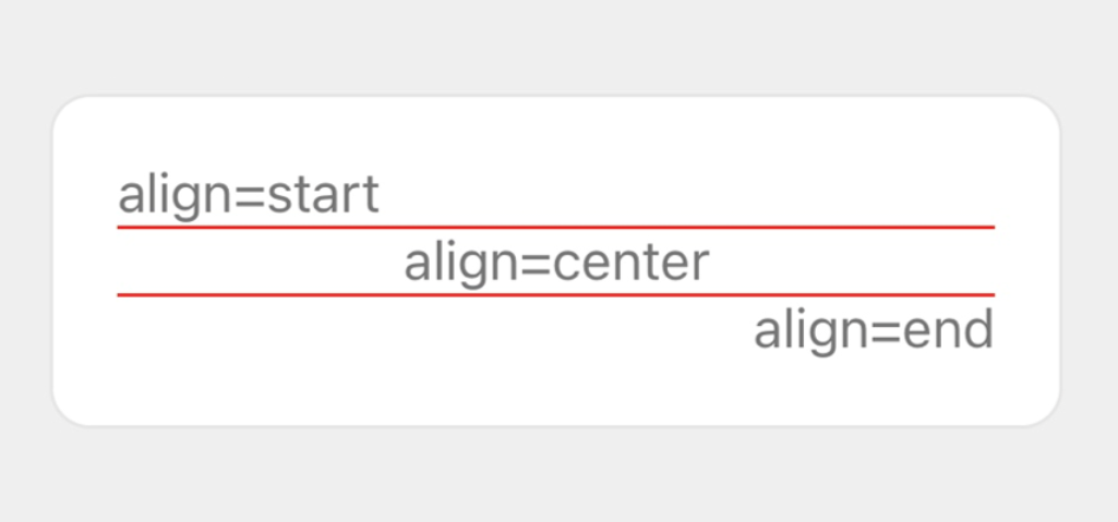
You can create the flexible template above with the following JSON data.
{ "type": "bubble", "body": { "type": "box", "layout": "vertical", "contents": [ { "type": "text", "text": "align=start", "align": "start" }, { "type": "separator", "color": "#ff0000" }, { "type": "text", "text": "align=center", "align": "center" }, { "type": "separator", "color": "#ff0000" }, { "type": "text", "text": "align=end", "align": "end" } ] }}Vertical alignment {#vertical-gravity}
You can specify the alignment style in the vertical direction (cross-axis direction) of a horizontal box using the gravity property. Specify one of the following values:
top: Top-aligned (default value)center: Center-alignedbottom: Bottom-aligned
Note
- This property is ignored in a baseline box.
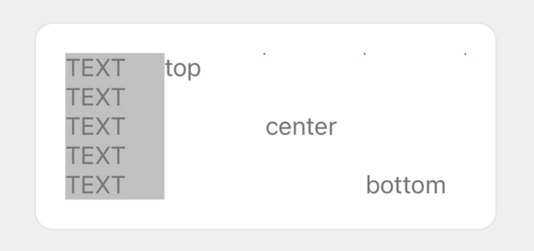
You can create the flexible template above with the following JSON data.
{ "type": "bubble", "body": { "type": "box", "layout": "horizontal", "contents": [ { "type": "box", "layout": "vertical", "contents": [ { "type": "text", "wrap": true, "text": "TEXT\nTEXT\nTEXT\nTEXT\nTEXT" } ], "backgroundColor": "#c0c0c0" }, { "type": "text", "text": "top", "gravity": "top" }, { "type": "text", "text": "center", "gravity": "center" }, { "type": "text", "text": "bottom", "gravity": "bottom" } ] }}Box padding {#padding}
You can specify the padding of a box using the paddingAll, paddingTop, paddingBottom, paddingStart, and paddingEnd properties. It expresses the size of blank space between the borderline of the box and the child components. You can specify a value in % (the percentage with reference to the width of the box) or in pixels, or specify one of the following values: none, xs, sm, md, lg, xl, and xxl. none does not set blank space while the other values do with the size of blank space increasing in the order they are listed.
If you specify the paddingTop, paddingBottom, paddingStart, and paddingEnd properties in addition to the paddingAll property, the paddingAll value will be ignored.
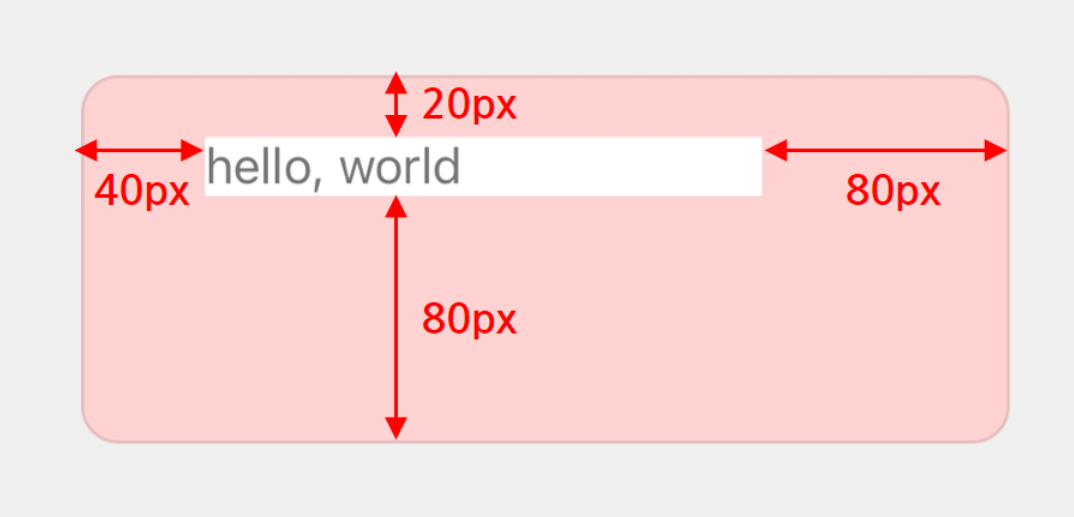
You can create the flexible template above with the following JSON data.
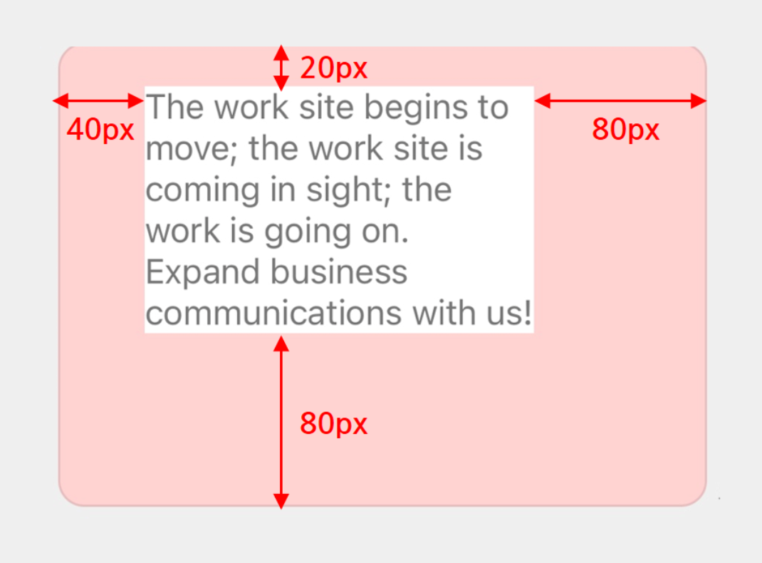
{ "type": "bubble", "body": { "type": "box", "layout": "horizontal", "contents": [ { "type": "box", "layout": "horizontal", "contents": [ { "type": "text", "text": "hello, world" } ], "backgroundColor": "#ffffff" } ], "backgroundColor": "#ffd2d2", "paddingTop": "20px", "paddingAll": "80px", "paddingStart": "40px" }}If you specify a longer text string in the example above, the layout will become as shown below.
spacing {#spacing}
The spacing property of a box containing child components specifies the minimum space between the components.You can specify one of the following values: none, xs, sm, md, lg, xl, and xxl. none does not set space while the other values do with the size of space increasing in the order they are listed.
In the following example, three vertical boxes are laid out at equal intervals (md) in the horizontal box.
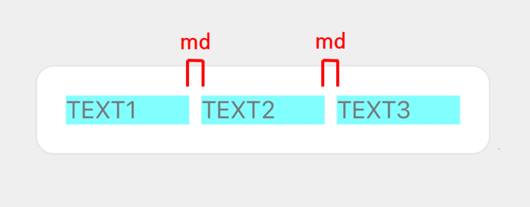
You can create the flexible template above with the following JSON data.
{ "type": "bubble", "body": { "type": "box", "layout": "horizontal", "spacing": "md", "contents": [ { "type": "box", "layout": "vertical", "contents": [ { "type": "text", "text": "TEXT1" } ], "backgroundColor": "#80ffff" }, { "type": "box", "layout": "vertical", "contents": [ { "type": "text", "text": "TEXT2" } ], "backgroundColor": "#80ffff" }, { "type": "box", "layout": "vertical", "contents": [ { "type": "text", "text": "TEXT3" } ], "backgroundColor": "#80ffff" } ] }}※ To override this setting for a specific component, set the margin property of that component.
margin {#margin}
The margin property determines the minimum space from the previous component.You can specify one of the following values: none, xs, sm, md, lg, xl, and xxl. none does not set space while the other values do with the size of space increasing in the order they are listed.
Note
- The
marginproperty takes precedence over thespacingproperty of the parent component. Themarginproperty set for the component inserted at the top of the box is not reflected in the layout.
In the following example, three vertical boxes are laid out in the horizontal box. The spacing property of the horizontal box is set to md, and the margin property of the third vertical box is set to xxl.
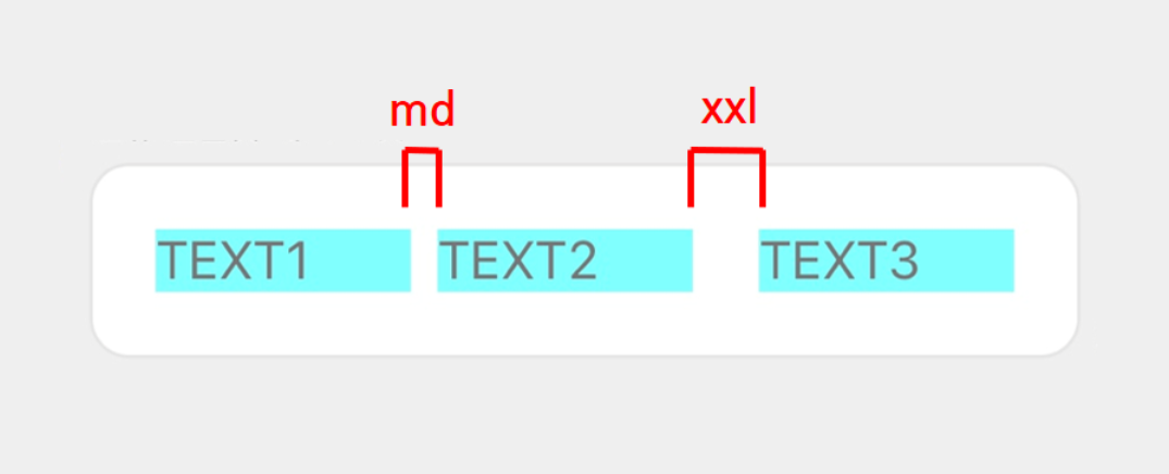
You can create the flexible template above with the following JSON data.
{ "type": "bubble", "body": { "type": "box", "layout": "horizontal", "spacing": "md", "contents": [ { "type": "box", "layout": "vertical", "contents": [ { "type": "text", "text": "TEXT1" } ], "backgroundColor": "#80ffff" }, { "type": "box", "layout": "vertical", "contents": [ { "type": "text", "text": "TEXT2" } ], "backgroundColor": "#80ffff" }, { "type": "box", "layout": "vertical", "contents": [ { "type": "text", "text": "TEXT3" } ], "backgroundColor": "#80ffff", "margin": "xxl" } ] }}Offset {#offset}
The positioning of components can also be adjusted by specifying the following properties:
position- The effect of the offset varies depending on the
positionvalue. You cannot useabsolutefor the box immediately below the block.
- The effect of the offset varies depending on the
offsetTop,offsetBottom,offsetStart, andoffsetEnd- You can specify a value in % (the percentage with reference to the size of the box) or in pixels, or specify one of the following values:
none,xs,sm,md,lg,xl, andxxl.
- You can specify a value in % (the percentage with reference to the size of the box) or in pixels, or specify one of the following values:
The following example changes the property of the horizontal box displayed as "TARGET" in order to explain the effect of the offset.
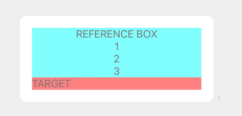
You can create the flexible template above with the following JSON data.
{ "type": "bubble", "body": { "type": "box", "layout": "vertical", "contents": [ { "type": "box", "layout": "horizontal", "contents": [ { "type": "text", "text": "REFERENCE BOX\n1\n2\n3", "align": "center", "wrap": true } ], "backgroundColor": "#80ffff" }, { "type": "box", "layout": "horizontal", "contents": [ { "type": "text", "text": "TARGET" } ], "backgroundColor": "#ff8080" } ] }}When the position property has a value of relative {#relative-position}
To perform alignment with reference to the regular position of components, set the position property to relative, and then specify the offset properties below. To understand how positioning works, see Relative positioning of CSS Positioned Layout Module Level 3.
| Property | Description |
|---|---|
offsetBottom | Specifies the amount moved to the bottom from the regular position. |
offsetStart | Specifies the amount moved to the left from the regular position. |
offsetEnd | Specifies the amount moved to the right from the regular position. |
offsetTop | Specifies the amount moved to the top from the regular position. |
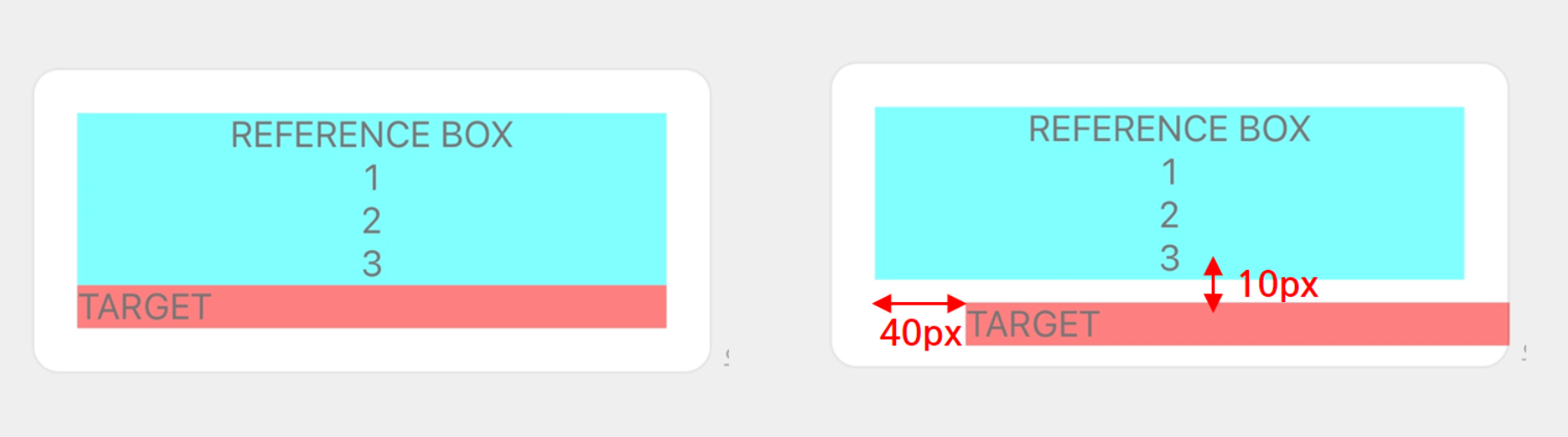
Let's specify the following properties for the horizontal box with "TARGET" in the previous example to see how offsets work.
| Property | Value |
|---|---|
position | relative |
offsetTop | 10px |
offsetBottom | - |
offsetStart | 40px |
offsetEnd | - |
The left and right bubbles are the ones before and after the offset values are changed, respectively.
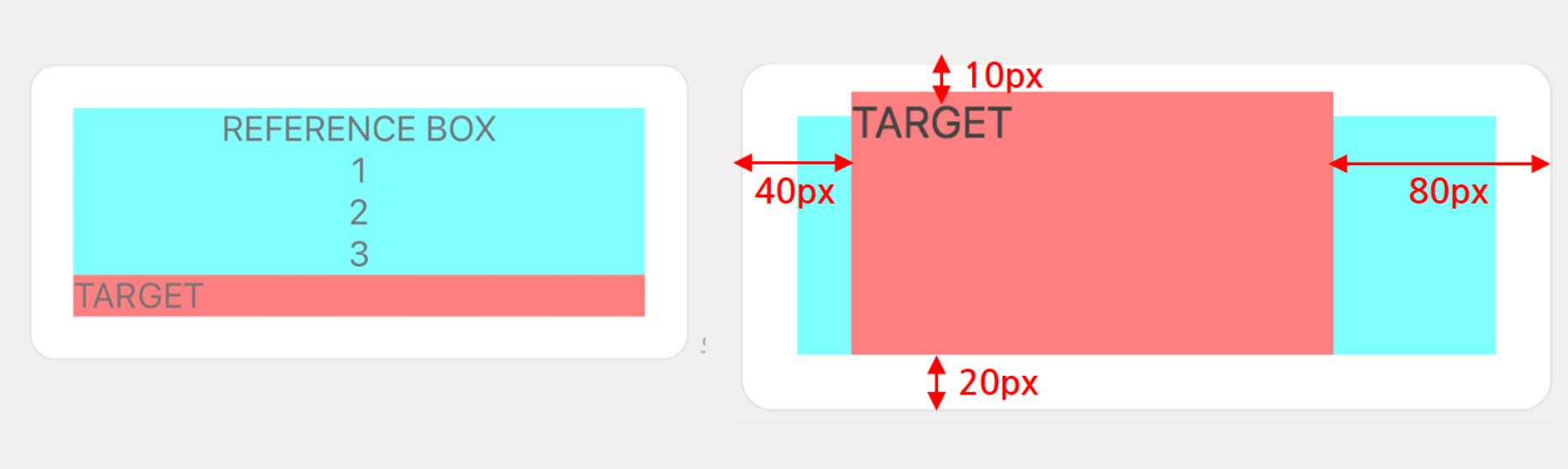
When the position property has a value of absolute {#absolute-position}
To lay out the components with reference to the outer frame of the parent component, set the position property to absolute, and then specify the offset properties below. To understand how positioning works, see Absolute positioning of CSS Positioned Layout Module Level 3.
| Property | Description |
|---|---|
offsetTop | Specifies the relative position from the upper end of the parent component to the upper end of the component. |
offsetBottom | Specifies the relative position from the lower end of the parent component to the lower end of the component. |
offsetStart | Specifies the relative position from the left end of the parent component to the left end of the component. |
offsetEnd | Specifies the relative position from the right end of the parent component to the right end of the component. |
Note
- If the
offsetproperty is not specified, the position of the component may vary from screen to screen. We recommend that you explicitly specify the offsets both vertically (offsetToporoffsetBottom) and horizontally (offsetStartoroffsetEnd).
Let's specify the following properties for the horizontal box with "TARGET" in the previous example to see how offsets work.
| Property | Value |
|---|---|
position | absolute |
offsetTop | 10px |
offsetBottom | 20px |
offsetStart | 40px |
offsetEnd | 80px |
The left and right bubbles are the ones before and after the offset values are changed, respectively.
Parent component and component size {#component-size}
A box with the position property of absolute neither affects nor is affected by the size of the parent component. Therefore, part of a component that is larger than the parent component is not displayed. If the component has become larger due to the effect of the parent component (free space), it returns to its original size.
Let's specify the following property for the horizontal box with "REFERENCE BOX" in the previous example.
| Property | Value |
|---|---|
position | absolute |
The left and right bubbles are the ones before and after the offset values are changed, respectively.
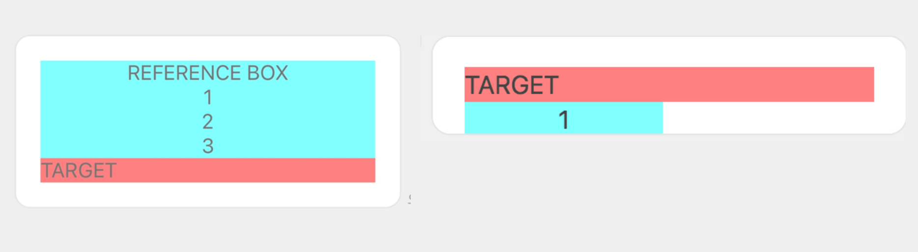
You can see that the size of the box with "REFERENCE BOX" neither affect nor is affected by the size of the parent component (vertical box). Therefore, the portions larger than the parent component (rows "2" and "3") are not displayed. Moreover, the blank space on the left and right that has become larger due to the effect of the parent component (free space) returns to its original size (width of the "REFERENCE BOX" box).
Rendering order {#drawing-layer}
Components are rendered in the order specified in JSON data. That is, the component written at the beginning of the JSON data is rendered right at the back, and the one written at the end is rendered right in the front of the bubble.
To change the rendering order, change the order of components specified in the JSON data.