Span
This component renders multiple text strings with different font properties in one row,
such as font color, size, weight and style. A span is specified by the contents property.
Like a text component, the text string of a span component to be sent can be written in multiple languages, and it will be displayed in the language that matches the client device's language settings.
Request {#span-request-parameter}
| Parameter | Type | Required | Description |
|---|---|---|---|
| type | string | Y | Set this parameter to span. |
| text | string | Y | Text string. If the wrap property of the parent text component is true, you can use a new line character (\n) to begin on a new line. |
| color | string | N | Font color. Set a hex color code. |
| size | string | N | Font size. Specify one of the following values: xxs, xs, sm, md, lg, xl, xxl, 3xl, 4xl, and 5xl.The font size increases in the order the values are listed. The default value is md. |
| weight | string | N | Font weight. Specify either regular or bold.If it is bold, the text string is made bold.The default value is regular. |
| style | string | N | Font style. Specify one of the following values: • normal: No style• italic: ItalicsThe default value is normal. |
| decoration | string | N | Text decoration. Specify one of the following values: • none: No decoration• underline: Underscore• line-through: StrikethroughThe default value is none. |
※ The decoration value of a text component does not overwrite that of a span component.
Request example {#span-request-example}
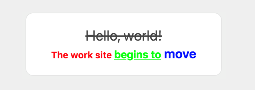
{ "type": "bubble", "body": { "type": "box", "layout": "horizontal", "contents": [ { "type": "text", "contents": [ { "type": "span", "text": "Hello, world!", "decoration": "line-through", "size": "xl" }, { "type": "span", "text": "\nThe work site ", "color": "#ff0000", "size": "sm", "weight": "bold" }, { "type": "span", "text": "begins to", "size": "md", "color": "#00ff00", "decoration": "underline", "weight": "bold" }, { "type": "span", "text": " move", "color": "#0000ff", "weight": "bold", "size": "lg" } ], "align": "center", "wrap": true } ] }}